Let’s start off by addressing all you rule-breakers out there! The ‘rule of three’ isn’t forcing you to do anything, it is more of a guiding light in what works really well when it comes to interior design.
It is a very simple trick that you can use to make your home look better.
Our brains work in a certain way that means we tend to prefer the appearance of things arranged in odd-numbered groupings.
Even numbers might, at first, seem like an obvious choice. After all, we also appreciate symmetry. However, we are adventurous souls as a species and odd numbers appeal to that side of us that gets restless with anything mundane.
The rule of three, in an interior design context, simply means that when arranging accessories, artwork, furniture, colours or a mixture of these things you want to try and use an odd number. Three tends to be the optimum odd number, with one being too small and lonely and five or more starting to become a bit cluttered.
That is not to say that larger odd numbers don’t work too in certain circumstances. A gallery wall of fifteen pictures will look great too!
Let’s discuss a few scenarios to demonstrate the power of the rule of three.
Colour

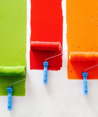
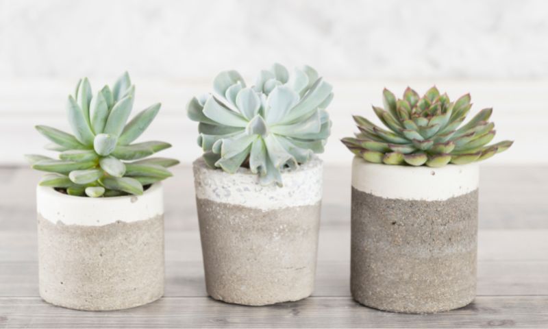
You may be imagining picture frames or pots of succulents with all this talk of the rule of three, but colour choices are affected too. And seeing as your walls, floors, ceilings and furniture all contribute to the way your colour scheme looks, it is quite a major consideration!
If you stick to one or two colours throughout a space it can quickly become a bit flat. Think in dimensions. We exist in 3 and 4 four dimensions and so, when we see a space made up of three main colours we can relate to it so much better.
We won’t consider the fourth dimension here… you don’t need to start adding colour changing paint (even if it did exist!).
The same goes with texture. Try and get some contrasting textures into a room by using rugs, curtains, throws and wall coverings.
Accessories

You don’t necessarily need to place three of any item together in a group. It is often better to think of three different items grouped together than compliment each other.
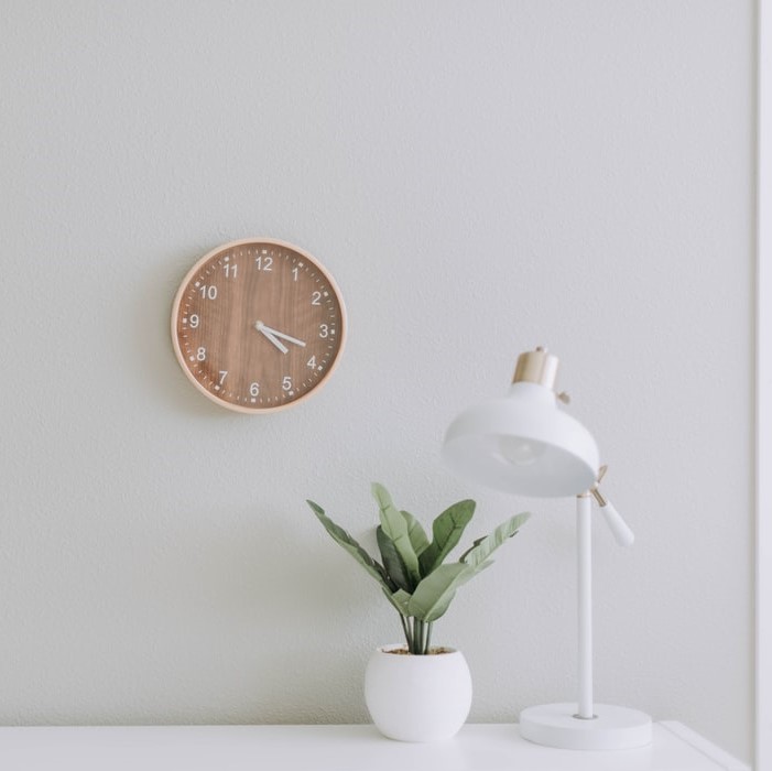
A good start is to use items of differing heights to add a bit more interest. For example, on a side table, you might have a table lamp, a vase and an interesting book. On a wall, you might have three pieces of artwork that are all of different sizes and styles.
That’s not to say that three identical (or just slightly different) items won’t work well. A good way to go about this is to try things out, stand back and edit as you go. If it feels right, then go with it!
Play around with colour and accessories by making the most of cushions on a sofa arranged in groups of three.
Furniture
Furniture might be a little trickier to keep to the rule, but you can combine furniture and accessories in a certain area to create the holy trinity of design!
If you have a blank wall space that could do with some furniture, think about having a couple of pieces, such as a sideboard and an armchair, and combining them with a picture frame above and between them to create a pleasing triangle.
If you have a symmetrical layout with a dining table or your arrangement of sofas, try adding something offset from it all, such as a floor lamp. Often, this will give the whole set-up a little more energy and edginess.
In a bedroom, having a bed in the centre of the room and bedside tables on either side really balances the whole room.
Fixtures & Fittings

You don’t need to just stick to the more temporary things in a room; the fixtures and fittings can be planned with the rule of three in mind too. It’s not a requirement, but in some circumstances, it can be very effective.
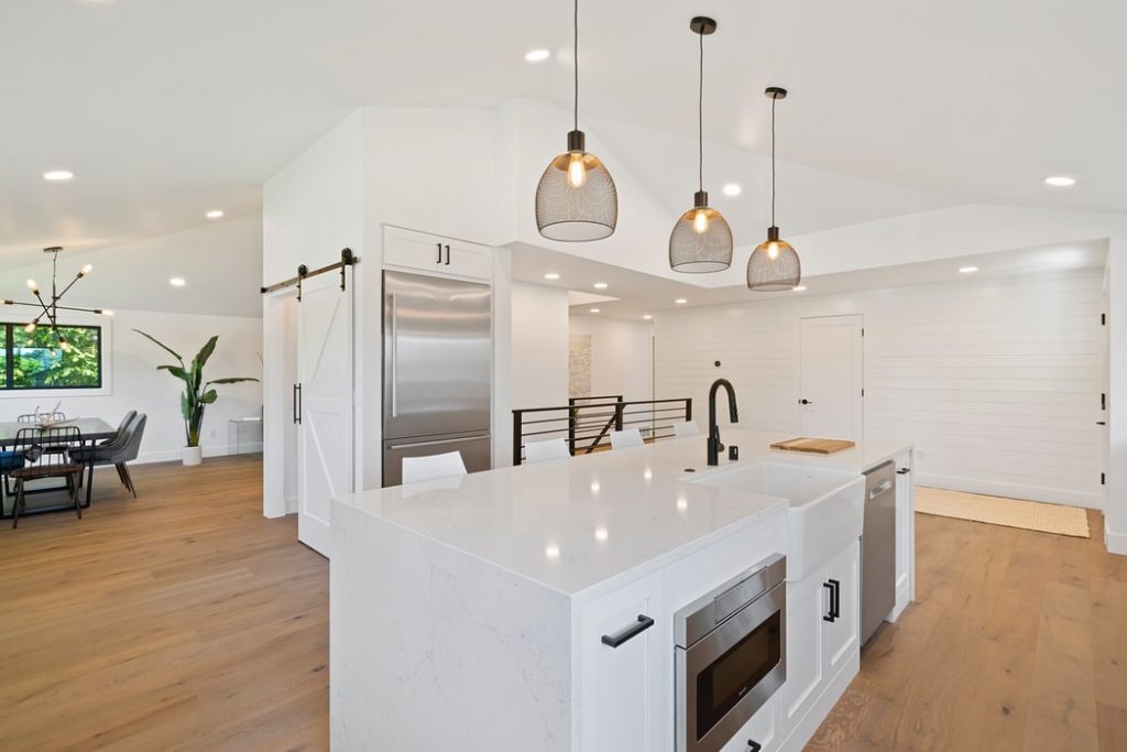
If you have a kitchen island with pendants over it, three will work better than one or two. If you have a feature light fitting, think about getting one that has three, or even five or seven lights in it.
Other Considerations
When arranging furniture using the rule of three, allow for conversation, movement and comfort to occur within the threes.
- Space for Conversation: Allow at least 3 feet (roughly 1 meter) between two people when seated at a table or desk.
- Space for Movement: When moving around your home, allow enough room for you and others to pass through without bumping into each other or objects along the way (e.g., coffee tables).
- Space for Comfort & Relaxation: Ensure there is enough space for everyone in the room to sit comfortably on their own piece of furniture (e.g., chairs and couches) without feeling crowded by someone else’s furniture pieces – this will help create an inviting environment where guests feel comfortable relaxing and enjoying themselves!
Ok, so we’ve established it’s not really a ‘rule’ of three, more of a ‘guidance’. However, there is a reason it exists and if you can incorporate some of this way of thinking into your interior design then it will have a positive impact.
The rule of three is a common design principle. The idea is that when you have three things in a room, they will create balance and harmony. This can be applied to any type of design theme, but it can be particularly effective in large, open rooms where one item can stand out more than the others in your space.
The interior design rule of three is a great way for new interior designers (and even experienced ones!) to keep their arrangements organized while still adding some flair and interest to them.
Have fun playing around with this concept and let us know how you get on!
You Might Also Enjoy:

