Welcome to our exploration of the captivating world of Art Nouveau colors. In this article, we will delve into the vibrant and elegant color choices that define the essence of this significant artistic movement.
Art Nouveau, known for its influence on interior design and various other artistic fields, has a distinct color palette inspired by nature. Its harmonious combination of soft and muted tones, such as olive green, mustard yellow, and peacock blue, with bold and dramatic accents like ruby red or deep violet, creates an atmosphere that is both romantic and dreamy.
With a lack of saturation and warm hues, the artistry of Art Nouveau colors enhances the overall ambience of spaces adorned with this style. Join us as we embark on a journey to understand the history, influence, and enduring popularity of Art Nouveau design.
A Brief History of Art Nouveau
Art Nouveau, a significant artistic movement that emerged in Europe during the late 19th and early 20th centuries, was born as a reaction against the industrial revolution. Its aim was to infuse art into everyday life, blurring the boundaries between fine arts and decorative arts. In the quest for a new visual language, Art Nouveau artists drew inspiration from organic shapes found in nature and combined them with angular, geometric forms.
Throughout its history, the popularity of Art Nouveau colors experienced shifts in trends. Initially, the movement favored softer and more natural hues, reflecting a desire to reconnect with the natural world. These colors embraced the gentle tones found in olive green, mustard yellow, and peacock blue, evoking a sense of tranquility and harmony. However, as Art Nouveau progressed, bolder and more vibrant tones gained momentum. The use of richer colors, such as ruby red and deep violet, added a touch of drama and intensity to the movement’s aesthetic.
Despite these evolutions in color trends, certain hues remained consistently popular throughout the Art Nouveau movement. The soft and earthy tones that captured the essence of nature continued to be key players in the palette. These enduring colors created an elegant and timeless atmosphere, making them a staple in Art Nouveau design.
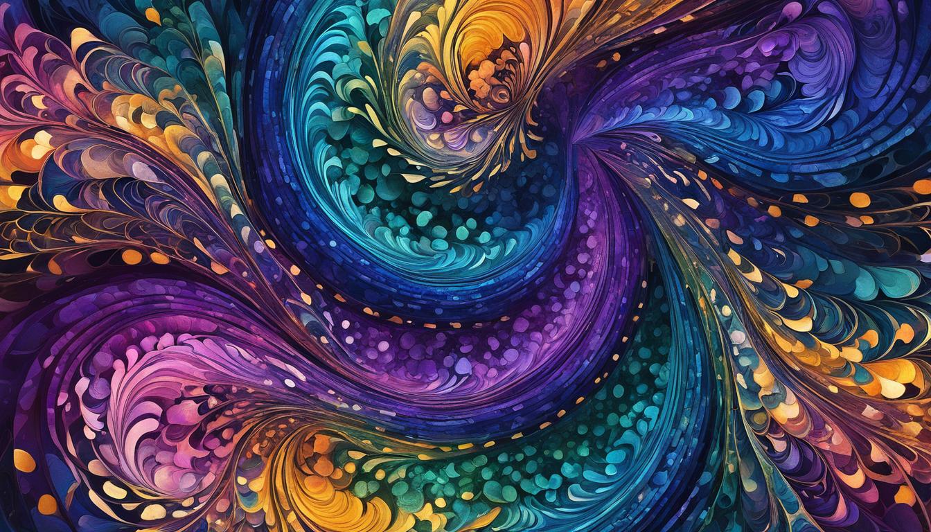
To get a visual sense of the captivating colors used in Art Nouveau, take a look at the image below:

As you can see, the selection of colors in this image exemplifies the vibrant yet subtle beauty of the popular art nouveau color palette. The combination of soft and muted tones with rich and bold accents showcases the captivating diversity of art nouveau colors.
The Influence of Art Nouveau in Design
Art Nouveau had a significant influence on various fields of design, including graphic design and architecture. This artistic movement introduced a new aesthetic that embraced fluid lines, natural inspiration, and the use of vibrant colors. One of the iconic aspects of Art Nouveau design is the combination of colors in prints and posters.
These prints often featured a single focal point, usually a sensual female figure, surrounded by organic shapes and intricate details. The color combinations used in Art Nouveau prints were carefully chosen to create a harmonious and visually appealing composition.

Art Nouveau color combinations are known for their striking effects and bold contrasts. The use of complementary colors, such as deep violet and mustard yellow, or peacock blue and ruby red, created a visual impact that captivated viewers. These iconic color combinations not only added vibrancy to the artwork but also enhanced the overall visual experience.
The incorporation of nature-inspired colors, like olive green and earthy tones, further reflected the Art Nouveau philosophy of blending art with natural elements. The color choices in Art Nouveau prints and posters played a crucial role in conveying the movement’s romantic and dreamy atmosphere.
The Significance of Color Combinations
Art Nouveau color combinations were more than just a visual spectacle. They served a purpose in amplifying the message and emotions of the artwork. The juxtaposition of vibrant and muted tones contributed to the overall composition’s balance and harmony.
- The combination of soft, muted colors with bold, contrasting accents evoked a sense of drama and dynamism. It allowed the focal point to stand out and draw attention while maintaining a cohesive visual narrative.
- The use of warm colors, such as ruby red or deep violet, created a passionate and sensual atmosphere, often associated with the Art Nouveau movement.
- On the other hand, the incorporation of natural and earthy tones added a sense of tranquility and connection to nature, which was a key aspect of Art Nouveau design.
These iconic color combinations left a lasting impact on the world of design and continue to inspire contemporary artists and designers. The harmonious blend of vibrant and muted tones in Art Nouveau prints and posters remains an influential design element, showcasing the richness and versatility of the movement’s color palette.
Materials and Furniture in Art Nouveau Design
Art Nouveau design is a true testament to the craftsmanship and attention to detail that defined this artistic movement. One of the distinguishing features of Art Nouveau spaces is the extensive use of a diverse range of materials, both natural and man-made, to create intricate and organic designs.
Wood, with its natural warmth and versatility, was a popular choice in Art Nouveau furniture and architectural elements. Whether it was beautifully carved oak panels or elegantly curved furniture pieces, wood added a sense of refined elegance to the overall design. Glass was another essential material, often used in stained glass windows, decorative lighting fixtures, and delicate ornamental details. Its translucent nature allowed for the play of light, further enhancing the ethereal beauty of Art Nouveau interiors.

Wrought iron, known for its strength and malleability, played a significant role in creating the distinctive sinuous lines and flowing shapes that are synonymous with Art Nouveau design. From whimsical ironwork on staircases and balconies to intricate patterns on furniture and decor, wrought iron showcased the movement’s dedication to craftsmanship.
When it comes to the color scheme in Art Nouveau design, furniture pieces were carefully upholstered in fabrics that complemented the overall aesthetic. These fabrics often featured the soft and muted color palette of Art Nouveau, with hues inspired by nature, such as olive green, mustard yellow, and peacock blue. The use of these elegant colors added a sense of harmony and tranquility to the space, enhancing the overall artistic ambiance.
Accessories and Decor in Art Nouveau Interiors
In Art Nouveau interiors, we can’t underestimate the impact of accessories and decor. These elements play a vital role in enhancing the overall aesthetic and creating a cohesive design.
Art Nouveau is all about embracing nature, and the decorative objects in these interiors reflect that ethos. They feature organic shapes, intricate patterns, and vibrant colors that beautifully complement the chosen art nouveau color palette.
One key aspect of art nouveau decor is the inclusion of various artwork and wall decor. Paintings, botanical illustrations, and sculptural pieces are displayed prominently, adding a touch of elegance and artistic flair to the space.

Lighting fixtures are also crucial in creating the desired ambiance in Art Nouveau interiors. Chandeliers, sconces, and table lamps with organic shapes and refined designs provide both functional lighting and aesthetic appeal.
When choosing accessories and decor for an Art Nouveau-inspired space, remember to opt for elegant art nouveau color choices. Look for pieces that feature the muted yet vibrant hues typically associated with Art Nouveau. These sophisticated color choices will help create a cohesive and visually pleasing environment that showcases the essence of this iconic design movement.
The Enduring Popularity of Art Nouveau Design
Despite the passage of time, Art Nouveau design continues to captivate design enthusiasts. The philosophy that art should be an integral part of everyday life and the emphasis on organic forms and elegant aesthetics have a timeless appeal. People seeking a visually pleasing and sophisticated ambiance are drawn to the enduring charm of Art Nouveau design.
One of the reasons for the popularity of Art Nouveau is its versatility. It can be adapted to different spaces and design preferences, making it a flexible choice for a variety of interior styles. Whether you prefer a traditional or contemporary look, Art Nouveau design elements can be seamlessly incorporated to create a unique and captivating space.
The harmonious blend of natural inspiration, craftsmanship, and color is another aspect that contributes to Art Nouveau’s long-lasting allure. The art nouveau color trends have evolved over time, but certain popular art nouveau colors have remained constant. The vibrant yet muted color palette, with its elegant choices of soft greens, warm yellows, and striking blues, creates a soothing and enchanting atmosphere in Art Nouveau interiors.
Source Links
- https://medium.com/re-write/art-nouveau-fd2935c4bd4
- https://www.linkedin.com/pulse/art-nouveau-embracing-grace-nature-curves-timeless-elegance
- https://chibirhm.livejournal.com/519432.html