Welcome to our article on Bauhaus Colors, where we delve into the fascinating world of primary colors, color theory, and their profound impact on modern design. The Bauhaus movement revolutionized the way we perceive and use color, paving the way for a new era of artistic expression and innovative design.
At the Bauhaus School, visionary artists and designers such as Johannes Itten, Paul Klee, and Wassily Kandinsky explored the emotional and psychological effects of color, creating a unique and impactful visual language. They went beyond aesthetics, embracing the principles of color symbolism and psychology to create a powerful and influential design movement.
In this article, we will discuss the importance of color in Bauhaus theory, its application in architecture and interiors, and its enduring legacy in contemporary design. We will also provide tips on how to incorporate Bauhaus colors into your own home, allowing you to create a space that is both functional and aesthetically pleasing.
Join us as we dive into the vibrant palette of Bauhaus Colors and discover the timeless beauty that continues to resonate in the world of design.
The Importance of Color in Bauhaus Theory
Color was an integral part of Bauhaus theory, playing a significant role in shaping the movement’s design principles. One of the key figures in Bauhaus color theory was Johannes Itten, who emphasized the subjective experience of color in conjunction with the objective laws of color perception. Itten’s color theory, derived from contrasting and polarizing colors, laid the foundation for design theory and art classes.
The Bauhaus artists and designers delved deep into the psychological and emotional effects of color, uncovering the profound power of color symbolism and color harmony. By carefully selecting and arranging colors, they created a visual language that conveyed meaning and evoked specific responses from viewers.

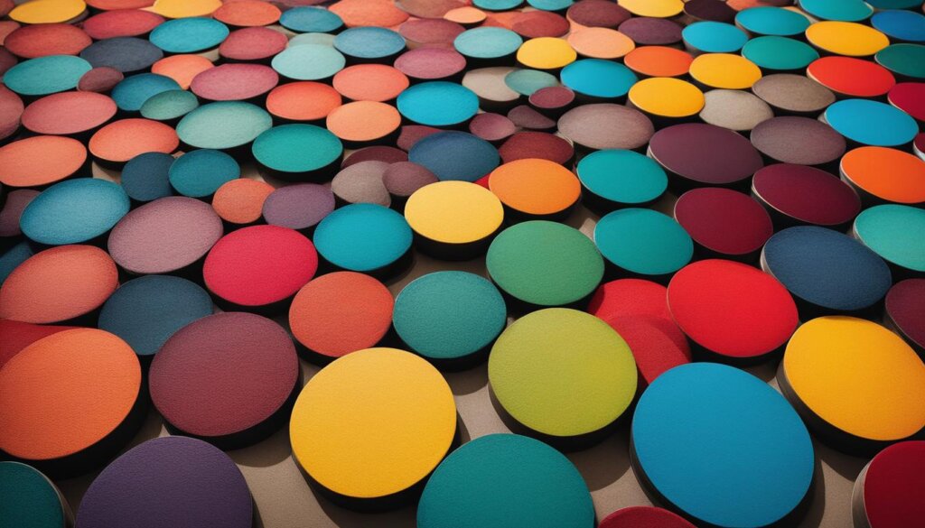
The color palette employed in Bauhaus design consisted of vibrant hues, often including primary colors such as red, blue, and yellow. These primary colors were chosen for their simplicity and ability to evoke strong emotional responses. In addition to primary colors, Bauhaus designers explored the use of complementary and contrasting colors to create harmonious visual compositions.
Color harmony, achieved through the use of complementary colors or analogous color schemes, was a fundamental aspect of Bauhaus design. The careful balance of colors in a composition helped to create a sense of unity and coherence, contributing to the overall impact and effectiveness of the design.
Bauhaus color theory went beyond aesthetics. It encompassed not only the visual appeal of colors but also their symbolic and psychological impact on the viewer. Colors were chosen based on their emotional associations and the responses they elicited, allowing designers to communicate ideas and evoke specific moods.
In conclusion, color played a vital role in Bauhaus theory, shaping the movement’s design principles and creating a visual language that conveyed meaning and emotion. The innovative use of color symbolism, psychology, and harmony by Bauhaus artists and designers continues to inspire and influence contemporary design practices.
Bauhaus Color in Architecture and Interiors
The Bauhaus style revolutionized not only the world of art and design but also architecture and interior design. While many people associate Bauhaus architecture with white cubes and flat roofs, true Bauhaus architecture embraced color as an integral part of its aesthetic. One notable example of the vibrant and harmonious color palettes used in the Bauhaus style can be seen in the interiors of the restored Masters’ Houses in Dessau.

The interiors of the Masters’ Houses showcase the meticulous selection and application of colors, creating a cohesive and visually striking environment. Bauhaus artists and designers carefully integrated color harmonies into the architecture and interiors, emphasizing the spatial effect and highlighting the holistic approach to design.
The color scheme used in the Masters’ Houses reflects the principles of Bauhaus color theory, which sought to evoke specific emotional and psychological responses. The careful combination of colors and their placement within the space creates a dynamic visual language, engaging viewers and enhancing the overall experience of the architectural design.
Bauhaus color is not merely about aesthetics, but also about functionality and intentionality. The use of color in the architecture and interiors was intended to enhance the purpose and functionality of each space, creating an environment that harmoniously blended form and function.
Key Features of Bauhaus Color in Architecture and Interiors:
- Vibrant and harmonious color palettes
- Strategic placement and integration of colors
- Spatial effect and emphasis on the holistic approach to design
- Intentionality and functionality of color choices
The enduring influence of Bauhaus color in architecture and interiors can still be seen today. Bauhaus-inspired designs continue to incorporate color in innovative and meaningful ways, reflecting the timeless appeal and lasting impact of the Bauhaus movement.
The Enduring Legacy of Bauhaus Color
The influence of Bauhaus color extends beyond its historical significance. Bauhaus design principles, including the innovative use of color, continue to inspire contemporary architecture and design. The emphasis on simplicity, functionality, and the careful selection of colors has stood the test of time and remains relevant in today’s design world. Bauhaus color continues to be a source of inspiration for designers who seek to create timeless and impactful spaces. The enduring legacy of Bauhaus color is a testament to its profound impact on the design world and its ability to evoke emotion and create meaningful connections with viewers.

In contemporary architecture, Bauhaus color is embraced for its ability to create impactful and visually appealing spaces. Designers draw inspiration from the harmonious color schemes and innovative use of color to create environments that are both aesthetically pleasing and functional. Timeless design principles championed by the Bauhaus movement continue to shape the way we approach architecture and interior design today, and the innovative use of color is a fundamental aspect of this enduring legacy.
The Timelessness of Bauhaus Color
Bauhaus color has a lasting influence on contemporary architecture due to its inherent timelessness. The minimalistic approach to design, coupled with carefully selected and balanced colors, creates spaces that transcend trends and remain visually appealing across generations. By incorporating Bauhaus color principles, architects and designers are able to create spaces that exude a sense of harmony and sophistication, while also allowing for personalization and individual expression.
Inspiring Visual Impact
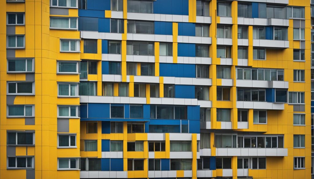
Another reason for the lasting influence of Bauhaus color in contemporary architecture is its ability to create visual impact. Whether it’s the use of bold primary colors or the incorporation of subtle color accents, Bauhaus color techniques have a transformative effect on the spatial experience. By skillfully integrating color into architectural elements, such as walls, ceilings, and furnishings, designers create environments that engage the senses and evoke emotional responses from viewers. This intentional use of color adds depth and character to contemporary spaces, making them memorable and impactful.
Creating Meaningful Connections
Bauhaus color goes beyond aesthetics and has the power to create meaningful connections with viewers. The intentional use of color harmonies and contrasts in contemporary architecture allows designers to evoke specific emotions and create atmospheres that resonate with people on a deeper level. Whether it’s the calming effect of a monochromatic color scheme or the vibrancy of contrasting hues, Bauhaus color techniques enable architects to craft spaces that engage and inspire individuals.
By embracing the enduring legacy of Bauhaus color, contemporary architects and designers can create spaces that stand the test of time, evoke emotion, and leave a lasting impression. Through the thoughtful integration of color, contemporary architecture continues to draw inspiration from the Bauhaus movement, ensuring that its timeless design principles and lasting influence endure for years to come.
Incorporating Bauhaus Colors into Your Home
If you want to bring the unique and innovative style of Bauhaus design into your home, there are several key elements to consider. Bauhaus design emphasizes minimalism and functionality, with clean lines and geometric shapes being prominent features.
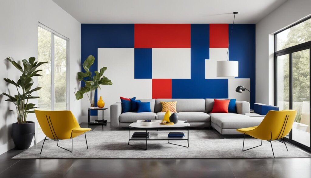
Incorporating Bauhaus colors into your home can be achieved through careful selection of furniture, lighting, and decor. Choose sleek and minimal furniture, opt for lighting fixtures with clean lines, and select art and decor that reflect the Bauhaus aesthetic.
Creating a cohesive Bauhaus color scheme is essential, focusing on primary colors and using white or black for contrast. By incorporating Bauhaus colors into your home, you can create a space that blends functionality with aesthetic appeal and reflects the enduring legacy of Bauhaus design.

