Dive into the past with our Retro 80s Colors Guide! Explore the trendy, iconic hues that defined a vibrant, bold era of fashion and style. The 1980s were known for their showmanship and use of bright colors, neon colors, vibrant colors, and retro colors.
From neon shades to pastel hues, the 80s color palette was all about making a statement. In this guide, we will take a closer look at the popular colors of the 80s, the differences in color palettes across various applications, and the significance of color in 80s culture.
Popular Colors of the 80s
When we think of the 80s, one of the first things that come to mind are the vibrant and iconic colors that defined the era. From neon shades to pastel hues, the 80s color palette was all about making a bold statement. Let’s take a closer look at some of the most popular colors of the 80s and how they were used.
Neon Colors
Neon colors were at the forefront of 80s fashion and design. Colors like neon pink, electric blue, and acid yellow were highly influential and made a striking impact. These bold and vibrant shades could be seen in clothing, accessories, makeup, and even vehicle decoration. Neon colors were a true representation of the energetic and electric atmosphere of the decade.
Pastel Colors
Pastel colors were also prevalent in the 80s, especially in preppy aesthetics. Soft and delicate shades like mint green, soft pink, baby blue, and Easter yellow were widely used in fashion, interior design, and graphic design. These colors brought a sense of femininity and sophistication to the era, balancing out the boldness of neon colors.
Vibrant Hues
Alongside neon and pastel colors, the 80s embraced bold and vibrant hues that reflected the energetic spirit of the decade. Hot pink, bright yellow, purple, and teal were popular choices that could be found in fashion, graphic design, and advertising. These vibrant colors added a sense of excitement and playfulness to the 80s aesthetic.
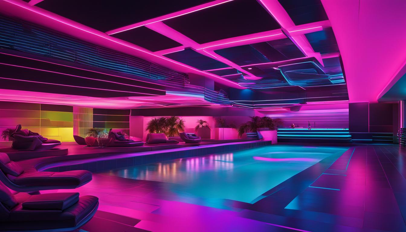
To get a visual sense of the popular colors of the 80s, take a look at this image:
As you can see, the image showcases a range of neon, pastel, and vibrant hues that epitomize the color trends of the 80s. These colors continue to be iconic and have recently experienced a resurgence in popularity, allowing us to bring back the fun and excitement of the retro era.
In the next section, we will explore the differences in color palettes across various applications in the 80s, including fashion, interior design, automotive, and graphic design.
Differences in Color Palettes across Applications
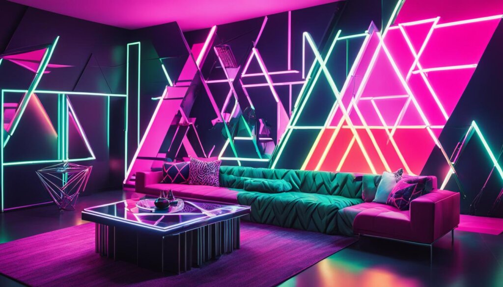
While the 80s color palette was iconic, different color combinations were popular across various applications.
In fashion, bold color blocking schemes were dominant, often featuring multi-color segments combined as rainbow colors.
In interior design, the focus was on contrasting colors, moving away from natural hues and incorporating more primary colors like red, yellow, and blue.
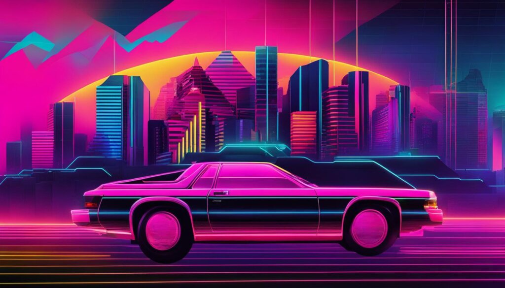
Automotive colors in the 80s saw a rise in popularity of red and metallic shades like silver and gold.
Graphic design embraced bold and saturated fluorescent colors, often used in Memphis design schemes, geometric patterns, and pop art.
These colors were also seen in advertising, often combined with natural beiges, pastel greens, and deep browns.
Fashion
- Bold color blocking schemes
- Multi-color segments combined as rainbow colors
Interior Design
- Contrasting colors
- Primary colors like red, yellow, and blue
Automotive
- Popular colors: red, silver, gold
- Metallic shades
Graphic Design and Advertising
- Embraced bold and saturated fluorescent colors
- Used in Memphis design schemes, geometric patterns, and pop art
- Combined with natural beiges, pastel greens, and deep browns
Significance of Color in 80s Culture
Color was more than just a matter of vintage color palettes in 80s culture. It was a powerful expression of individuality and a reflection of the vibrant and energetic atmosphere of the decade. The use of bright and vivid colors in fashion, graphic design, and advertising was heavily influenced by the booming economy, the focus on youth, and a general shift toward optimism. These colors helped people stand out and express their unique personalities in a time of great change.
Color symbolism played a crucial role in shaping the 80s. For example, the intense greens seen in the fashion of the time not only represented a connection with nature but also reflected a growing environmental consciousness. This trend was amplified through popular culture, with TV shows, movies, music, and technological progress all contributing to the vibrant and iconic 80s color trends that are still celebrated and nostalgic today.
80s culture was also heavily influenced by the significant changes happening around the world. The color choices in fashion, design, and advertising were influenced by the electrifying and dynamic global events of the time. The use of bright and bold colors conveyed a sense of energy and excitement, reflecting the social and political shifts that were happening at that time.
Furthermore, the significance of color in 80s culture can be seen in the way it was used to define different subcultures and movements. For example, the punk movement embraced dark and moody colors, reflecting a sense of rebellion and defiance. On the other hand, the preppy style favored bright pastels, showcasing a more refined and upscale aesthetic.
Overall, color played a crucial role in shaping and defining the 80s culture. It went beyond mere fashion choices and became a form of self-expression and a symbol of the times. The vibrant and iconic 80s colors continue to evoke nostalgia and are still celebrated today for their boldness, vibrancy, and ability to capture the spirit of that era.
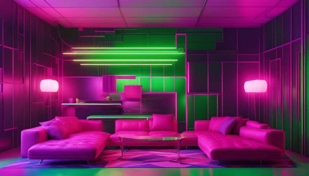
Kelly Green
Kelly green was a rich and bold color that was part of the preppy aesthetic of the 80s. It was often used on built-in bookshelves or as a powder room cabinet. This high gloss color added a touch of neatness and sophistication to any space.
Turquoise
Turquoise is a joyful color that combines the calming qualities of blue with the brightness of sunny yellow. Its vibrant and energetic nature makes it a perfect addition to the 80s color palettes. In the 1980s, turquoise was commonly seen in Mexican and Persian tiles, as well as the colorful exteriors of Caribbean buildings.
Adding turquoise to a space brings a sense of escapism and creates a mini-vacation from the mundane. It instantly uplifts the mood and adds a refreshing touch. Turquoise looks absolutely gorgeous when paired with trim in white or black, creating a striking contrast that enhances its beauty.
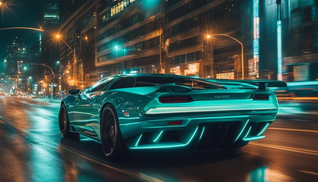
Visual Example: A stunning turquoise room with white trim and accents.
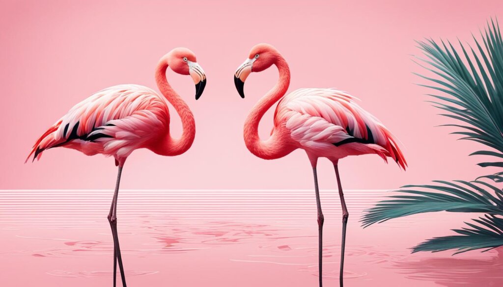
Flamingo and Baby Pink
Flamingo and baby pink were soft and feminine colors that were used across various applications in the 80s. They were often paired with graphic black and white or sage green and cabbage roses. These light pinks were flattering to skin tones and were perfect for bedrooms or bathrooms. To counter their femininity, they could be balanced with charcoal, saddle leather, or navy.
Flamingo and baby pink, with their delicate and romantic hues, captured the essence of femininity in the 80s. These colors were commonly seen in fashion, interior design, and even graphic elements. Whether used in clothing, home decor, or accessories, these pastel pinks added a touch of elegance and sophistication to any application.
Flamingo and baby pink were often paired with contrasting colors to create bold and intriguing combinations. Graphic black and white provided a striking contrast that emphasized the softness of the pinks, while sage green and cabbage roses added a touch of vintage charm. These complementary pairings brought visual interest and created a harmonious balance in any design.
In interior design, flamingo and baby pink were popular choices for bedrooms and bathrooms. Their soothing and calming qualities made them ideal for creating relaxing and serene spaces. Whether used on walls, furniture, or accessories, these light pinks added a touch of elegance and femininity.
To prevent the overwhelming femininity of these colors, it was common to balance them with darker and more masculine hues. Charcoal, saddle leather, and navy provided a contrast that added depth and sophistication to the overall design. This balance created a space that was both inviting and balanced, appealing to a broader audience.
Flamingo and baby pink were versatile colors that could be used in a variety of applications in the 80s. Their soft and feminine qualities, when paired with the right accents, created visually appealing and harmonious designs. Whether you’re looking to add a touch of elegance to your wardrobe or create a serene and soothing space in your home, consider incorporating these iconic pastel pinks.
Aqua
Aqua, a gorgeous pastel color, brings a breezy and soft mood to any space. Its gentle hue creates a calming and tranquil atmosphere that evokes feelings of serenity and relaxation. In the 80s, aqua was a popular choice in color palettes, often paired with classic black and white. The combination of aqua with black and white creates a striking contrast that adds a modern and sophisticated touch to any design.
Aqua can also be paired with shades of orange, its complementary color on the color wheel, to create a vibrant and energetic look. The combination of aqua and orange adds a pop of color and a playful element to a space, making it visually appealing and exciting to the eye.
To bring the beauty of aqua into your home or design, consider incorporating it into furniture, accent pieces, or wall color. An aqua-colored sofa or a set of aqua dining chairs can become a focal point in a room, while smaller decor items like pillows, throws, or artwork can add subtle touches of aqua throughout.
Whether used as the main color or as an accent, aqua is a versatile and timeless choice that can enhance any design style. Its soft and fresh appearance makes it particularly well-suited for coastal, Scandinavian, or contemporary aesthetics.
Black
Black was a decadent and bold color that epitomized the exuberance of the 80s. It added style, mood, and glamour to any space. Whether used in a cozy lounge or a bar or media room, black made a statement and created a dramatic atmosphere.
When incorporated into 80s color palettes, black provided a striking contrast to the vibrant neon and pastel shades that were popular during that era. It served as a grounding element, enhancing the overall visual impact of the color scheme.
In fashion, black was often used as a base color to highlight and accentuate other bright and bold hues. It created a sleek and edgy look, epitomizing the punk and rock-inspired fashion of the decade.
In interior design, black was used to add sophistication and depth to spaces. It worked well as a dominant color or as an accent, depending on the desired effect. When paired with metallic accents and reflective surfaces, black created a glamorous and luxurious ambiance.
Black was also prominent in 80s graphic design, where it was used to create contrast and make colors pop. The combination of black and neon shades was particularly popular, giving designs a futuristic and high-energy feel.
In summary, black was a prominent color in 80s color palettes, adding style, mood, and glamour to various applications. Whether used in fashion, interior design, or graphic design, black made a bold statement and contributed to the vibrant and energetic atmosphere of the decade.
Conclusion
The 80s were a decade of boldness and vibrancy, as seen in the use of colors across various applications. From neon and pastel shades to bold and vibrant hues, the 80s color palette not only defined the fashion, interior design, automotive, and graphic design trends of the era but also left an enduring impact on popular culture.
These retro colors continue to evoke nostalgia and have recently experienced a resurgence in popularity. Their vibrant and energetic nature adds a sense of fun and excitement to any space. By incorporating 80s color trends into our homes and designs, we can infuse a touch of the past and create a unique visual experience.
Let’s embrace the retro vibes and unlock our creativity with the vibrant and trendy hues of the 80s. Whether in fashion, interior design, or graphic presentations, the 80s color palettes offer a wide range of possibilities to make a statement and stand out from the crowd. So go ahead, indulge in the bold and vibrant shades of the 80s, and make your designs truly unforgettable!
