Welcome to our colorful journey back to the 1970s! The 70s was a decade that brought us an explosion of vibrant colors and groovy design choices, leaving an everlasting impact on pop culture, fashion, and interior design. In this article, we’ll take you through the iconic 70s colors, retro color palettes, and vintage color schemes that defined this disco era. Get ready to immerse yourself in psychedelic colors, groovy color combinations, and neon hues that will transport you straight to the vibrant and vibrant 70s. So put on your rose-colored glasses, and let’s get groovy!
Embracing Nature’s Hues
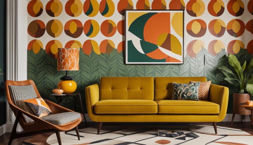
In the groovy era of the 70s, interior design wholeheartedly embraced the comforting embrace of nature’s warm and earthy hues. Avocado green, harvest gold, and burnt orange became the quintessential colors that enveloped homes, creating a groovy and earthy ambiance.
These nature-inspired colors reflected the laid-back and bohemian ethos of the era, taking inspiration from the beauty of the natural world. Avocado green embodied the lushness of nature, while harvest gold captured the warmth of a golden afternoon. Burnt orange added a touch of spice and energy to the color palette.
These earthy tones found their way into every aspect of interior design, from appliances to upholstery and even shag carpets. Homes were transformed into cozy sanctuaries where the vibrancy of the 70s came alive.
By infusing your decor with these iconic earthy tones, you can effortlessly time-travel back to the spirit of the 70s and capture its authentic nostalgia. Whether it’s a statement piece of furniture, a pop of color on the walls, or smaller accents throughout the space, incorporating avocado green, harvest gold, and burnt orange will transport you to a bygone era of peace, love, and grooviness.
The Iconic ’70s Conversation Pits
One of the defining design features of the 70s was the conversation pit. These sunken seating areas, often adorned with shag carpets and built-in seating, became a symbol of nostalgia and charm in living rooms. Conversation pits offered a cozy and communal space for family and friends to gather and engage in lively discussions. They were a popular trend in the 70s and added a touch of retro charm to homes.
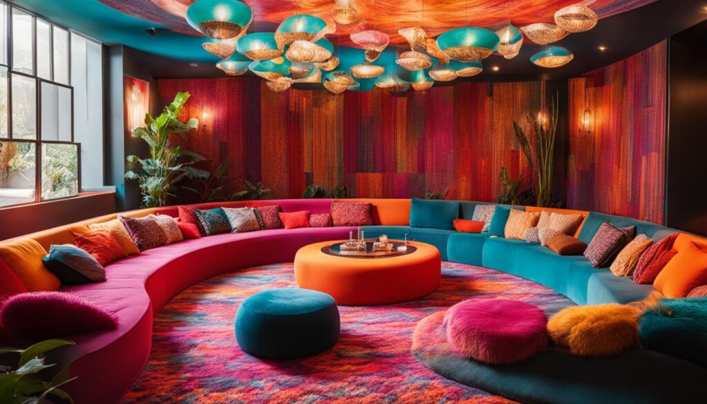
The 70s was known for its unique approach to interior design, and conversation pits embodied the era’s emphasis on creating welcoming and communal spaces. With their sunken seating and comfortable shag carpets, these conversation pits invited people to gather and socialize. Whether it was for a casual chat or hosting a lively get-together, these sunken seating areas provided a cozy and intimate atmosphere.
Conversation pits were often designed as extensions of the living room or den, seamlessly blending in with the surrounding decor. They were usually situated in the center of a room, allowing for easy access and creating a focal point that drew people in.
The Appeal of Conversation Pits
- Cozy and inviting: The sunken seating and plush shag carpets created a cozy and relaxed atmosphere that encouraged conversation and connection.
- Communal spaces: Conversation pits were designed to bring people together, providing a dedicated area for socializing and bonding.
- Retro charm: These unique seating areas have a distinct retro charm that instantly transports you back to the groovy vibes of the 70s.
- Flexible seating: With their built-in seating, conversation pits offered flexibility and convenience, accommodating both large gatherings and intimate gatherings.
In today’s modern homes, conversation pits may not be as prevalent, but their influence can still be seen in the creation of cozy and communal spaces. The 70s color palette and retro design elements continue to inspire homeowners and designers alike, keeping the spirit of the conversation pit alive.
Colorful Liberation
In the groovy decade of the 70s, interior design boldly embraced exuberant color choices that celebrated individuality and freedom. Vibrant hues like bright orange, avocado green, and harvest gold dominated entire rooms, injecting a sense of energy and liveliness into the space.
The influence of pop art and psychedelia was evident in the color palettes of the era. These art movements inspired the use of contrasting and clashing colors, creating an electric atmosphere within homes. The 70s were all about breaking traditional design rules and embracing vibrant and unconventional color combinations.
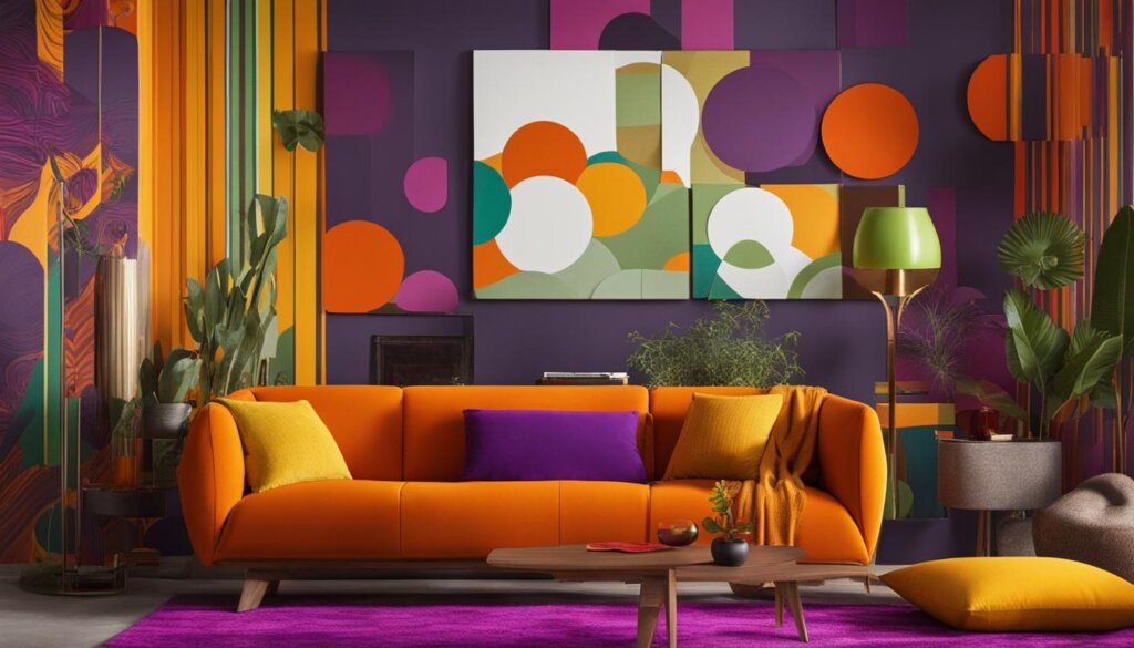
Inspired by this era, many designers and homeowners today incorporate 70s colors into their spaces, infusing them with a retro charm. The use of vibrant hues not only adds visual interest but also creates a dynamic and lively ambiance.
Key Features:
- Exuberant and bold color choices
- Influence of pop art and psychedelia
- Contrasting and clashing color combinations
- Vibrant and energetic atmosphere
- Celebration of individuality and freedom
Embrace the vibrant spirit of the 70s by incorporating retro color palettes and exploring the endless possibilities of vibrant hues. Channel your inner artist and create a space that reflects your unique personality and style.
The Rise of Earth Tones
The 70s saw a return to nature, with a prominent use of earthy tones in fashion and design. Olive green, mustard yellow, and burnt orange emerged as popular color choices, adding a touch of comfort and nostalgia to the era. These warm and natural hues perfectly complemented the bohemian and hippie styles that defined the decade. In interior design, these earthy tones were often paired with natural materials like wood and wicker, creating a harmonious and organic aesthetic.
Whether it was olive green curtains, mustard yellow upholstery, or burnt orange accent walls, these earthy tones brought a sense of grounding and connection to the natural world. They exuded warmth and richness, making spaces feel cozy and inviting. It was a departure from the vibrant and electric colors of the previous decade, reflecting a desire for a more laid-back and earth-centric lifestyle.
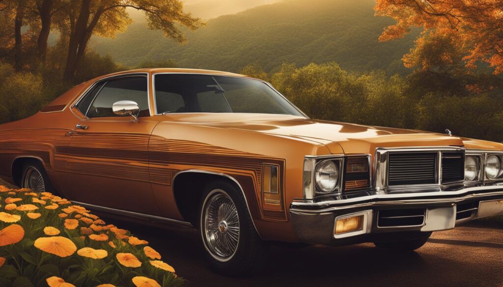
The nostalgic charm of earthy tones in interior design- a tribute to the 70s era.
The resurgence of earthy tones in contemporary design is a testament to their timeless appeal. Today, many homeowners are drawn to these colors for their ability to create a soothing and serene atmosphere. Whether it’s using olive green in a bedroom for a tranquil retreat or infusing a living room with burnt orange accents for a cozy and inviting space, these earthy tones can effortlessly add warmth and character to any room.
The Allure of Olive Green
Olive green, with its natural and earthy appeal, was a quintessential color of the 70s. It evoked a sense of calm and serenity, reminiscent of lush green landscapes. Today, olive green is making a comeback in interior design, and its versatility allows it to be used as a neutral backdrop or a bold accent color.
Mustard Yellow: A Pop of Sunshine
Mustard yellow captured the essence of the 70s, bringing a pop of sunshine into homes. This vibrant and warm hue added energy and brightness to any space, making it a popular choice for upholstery, accessories, and even kitchen appliances. Its cheerful and playful nature continues to inspire designers today.
Burnt Orange: Embracing Warmth
Burnt orange symbolized warmth and comfort in the 70s. It created a cozy and inviting atmosphere, reminiscent of autumnal hues. This earthy and rich color can add depth and character to a room, making it an excellent choice for accent walls, throw pillows, or statement furniture pieces.
Embracing the earthy tones of the 70s allows us to create spaces that echo the bohemian spirit and the connection to nature that defined the era. By incorporating olive green, mustard yellow, and burnt orange into our interiors, we can infuse our modern lives with a touch of nostalgia and warmth.
Psychedelic and Neon Colors
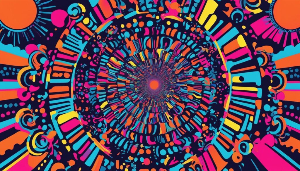
In the vibrant world of 70s colors, psychedelic and neon hues took center stage, channeling the boldness and energy of the era. Inspired by psychedelic art and the disco culture, hot pink, electric blue, and neon green emerged as eye-catching colors that made a statement and demanded attention. These vibrant shades were used in fashion, interior design, and even album covers to create a visual feast for the senses.
Imagine walking into a 70s nightclub, the neon lights pulsating to the rhythm of the music. The vibrant colors on the walls and the glow-in-the-dark dance floor created an otherworldly atmosphere that transported people to a different dimension. These neon hues symbolized the spirit of rebellion and nonconformity that defined the 70s, inviting individuals to break free from societal norms and express their true selves.
The Magic of Hot Pink
One of the standout colors of the 70s was hot pink. This bold and vibrant hue added a dose of excitement and femininity to clothing, accessories, and home decor. Whether it was a hot pink jumpsuit, a neon pink boombox, or a fuchsia shag rug, hot pink was synonymous with daring and confident fashion choices.
Electric Blue: A Color That Thrilled
Electric blue captured the essence of the disco era, evoking a sense of excitement and electricity. This intense shade of blue represented the joy and energy of the dance floor, often adorning disco balls, clothing, and disco-inspired home decor. It radiated confidence, inviting individuals to express their inner disco diva and hit the dance floor with style.
The Neon Green Revolution
Neon green was the color of choice for those who wanted to stand out from the crowd. Associated with the punk and new wave movements of the 70s, neon green symbolized rebellion and a pioneering spirit. Bands like The Clash and The Sex Pistols embraced this color, using it in their album covers and stage outfits to make a bold and unforgettable statement.
Today, the resurgence of retro 70s colors continues to inspire designers and homeowners. Incorporating psychedelic and neon colors into your modern decor can add a touch of nostalgia and create a vibrant and eclectic space that pays homage to the bold spirit of the 70s.
Bold Patterns and Prints
The 70s was a time of creative experimentation with patterns and prints. From the psychedelic swirls of paisley to the angular and bold geometric designs, and the timeless charm of floral prints, these patterns dominated fashion, textiles, and interior design.
In the 70s, mixing and matching patterns was all the rage, allowing individuals to showcase their free-spirited and unconventional fashion and design choices. The era was marked by an explosion of vibrant colors and daring combinations, creating a visually stunning and energetic atmosphere.
Adding bold patterns and prints to your 70s-inspired decor is an excellent way to infuse personality and make a statement. Whether it’s a paisley accent chair, geometric wallpaper, or floral print curtains, these designs reflect the lively and vibrant nature of the 70s. By incorporating these bold patterns into your space, you can create a retro-inspired look that is as eye-catching as it is nostalgic.
